O Gerador de Conceitos de Embalagem de Produto: Transforme um Briefing de Marca em Direções Visuais Prontas para a Prateleira
Porque é que este prompt importa
CPG brands that skip concept exploration and jump straight to final packaging art routinely burn $15,000-$40,000 in wasted tooling and print runs when the first design doesn't perform on shelf. Testing three genuinely different visual strategies before committing catches positioning mismatches — like a 'premium' brand that accidentally reads as budget private-label — before a single carton goes to print.
Para que o usamos
You're the marketing manager at a 12-person DTC beverage startup. Your co-founder wants packaging that "pops on a Whole Foods shelf," you have no in-house designer, and the agency quote for three initial concepts is $8,000 with a three-week turnaround. You need three visually distinct directions to bring into tomorrow morning's founder meeting.
Prompt
Act as a senior packaging designer with expertise in CPG (consumer packaged goods) shelf strategy.

Context: I'm developing packaging for [PRODUCT NAME], a [PRODUCT CATEGORY] targeting [TARGET AUDIENCE]. The brand positioning is [BRAND POSITIONING, e.g., premium/eco-friendly/playful/minimalist]. The packaging format is [FORMAT: box, bottle, pouch, can, jar]. Primary brand colors are [COLOR PALETTE]. Competitors on the shelf include [COMPETITOR BRANDS].

Task: Generate three distinct packaging concept directions. For each concept, provide:
1. A concept name
2. A one-paragraph visual description (shape, color blocking, material finish, texture)
3. The psychological/shelf-impact rationale — why this concept stands out or signals the right positioning
4. One production consideration (cost tier, material sourcing, or manufacturing complexity)

Constraints:
- Do not include specific logo wordmarks or legible text in the visual descriptions — focus purely on shape, color, material, and composition
- Each of the three concepts must use a genuinely different visual strategy (e.g., one minimalist, one bold/saturated, one textured/tactile) — do not give three variations of the same idea
- Ground every claim in a real packaging design principle (shelf standout distance, color psychology, material-signals-price-point), not generic adjectives
- Flag if the target audience and brand positioning are in tension (e.g., 'premium' + 'budget-conscious Gen Z' need reconciling)

Output format:
For each of the 3 concepts, use this structure:
**Concept [number]: [Name]**
- Visual description: [paragraph]
- Why it works: [paragraph]
- Production note: [1-2 sentences]
Resultado
Concept 1: Field Study
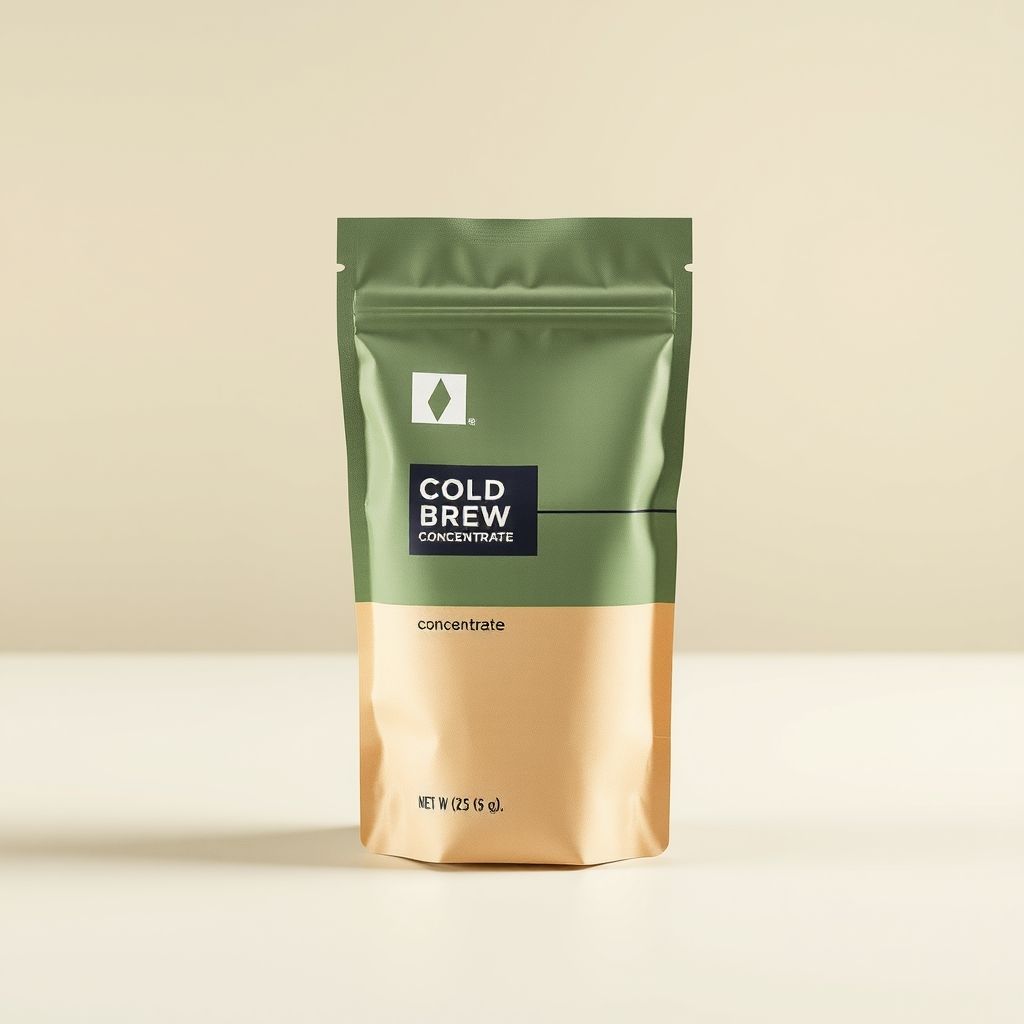
Visual description: A kraft-textured matte pouch split horizontally — sage green occupying the top two-thirds, warm cream-tan below. A single thin charcoal line divides the two color blocks at an asymmetric point (roughly 60/40 rather than center), with a small geometric diamond mark near the top as the only graphic element. The material reads as recycled kraft paper laminate rather than glossy plastic film.
Why it works: The asymmetric color split signals 'crafted, not mass-produced' — a well-documented shelf cue where centered, symmetric packaging reads as corporate/mass-market and off-center compositions read as artisanal. Sage and cream together test consistently in CPG color research as 'natural, premium, low-sugar' signals, which matters directly for a cold-brew concentrate audience that associates bright primary colors with artificially sweetened products.
Production note: Kraft laminate pouches run mid-tier cost — more expensive than glossy BOPP film, cheaper than glass or aluminum. Minimum order quantities for custom kraft stock typically start around 5,000 units.
Concept 2: Saturation Block
Visual description: A single saturated forest-green pouch, full-bleed color with no horizontal split, matte finish, and one bold horizontal cream stripe at eye level carrying the only typography.
Why it works: Full-bleed saturated color maximizes shelf standout distance — the metric packaging designers use for how far away a product remains visually distinct from competitors. This concept trades subtlety for visibility, appropriate if the brief prioritizes discovery over premium signaling.
Production note: Full-coverage color printing costs slightly more in ink but simplifies file prep versus multi-block designs.
Concept 3: Tactile Minimal
Visual description: An unbleached natural kraft pouch with no added color block, a debossed (pressed, not printed) geometric pattern, and a single small label patch.
Why it works: Debossing signals tactile premium quality disproportionate to its cost, and undyed kraft is the strongest 'zero added processing' visual cue in the sustainable-beverage category.
Production note: Debossing requires a custom die, adding tooling cost (roughly $800-1,500 one-time) but no added per-unit cost at volume.
Flagged tension: the brief's 'premium' positioning combined with a DTC startup's realistic budget constraints pulls toward Concept 1 or 3 over Concept 2 — saturated full-color printing often reads as 'trying hard' rather than premium at this price tier.
Note: the generated hero image for Concept 1 rendered some placeholder typography despite the prompt's no-text constraint — current image models render small text unreliably. Treat generated text in concept-stage mockups as a placeholder; the wordmark and final typography are a separate design pass.
Imagem gerada
A maioria dos prompts de geração de imagens de IA para trabalho de produto segue um único padrão: descreva o resultado, obtenha uma imagem, espere que funcione para o seu fluxo de trabalho real de embalagem. Esse padrão falha para designers e profissionais de marketing por um motivo específico: uma única imagem não oferece forma de comparar direções estratégicas entre si.
Este prompt foi construído para forçar divergência genuína. A restrição "cada um dos três conceitos deve usar uma estratégia visual genuinamente diferente" existe porque, sem ela, a maioria dos modelos recorre por padrão a três variações menores da mesma ideia.
A restrição de "sem texto legível ou logos" é uma simplificação deliberada, não uma limitação. Os modelos de imagem atuais renderizam tipografia pequena de forma pouco confiável.
O requisito de nota de produção no formato de saída existe porque decisões de embalagem não são puramente estéticas. Um conceito bonito que exige uma matriz personalizada e um pedido mínimo de 50.000 unidades não é uma opção real para a primeira produção de uma startup de 12 pessoas.
A instrução final — sinalizar tensão entre público-alvo e posicionamento de marca — captura um modo de falha que ocorre constantemente no branding em estágio inicial: um fundador pede "premium" e "Gen Z consciente do orçamento" na mesma frase sem perceber que isso puxa em direções visuais opostas.