ایدهساز بستهبندی محصول: تبدیل خلاصه برند به طرحهای بصری آماده برای قفسه
چرا این پرامپت اهمیت دارد
CPG brands that skip concept exploration and jump straight to final packaging art routinely burn $15,000-$40,000 in wasted tooling and print runs when the first design doesn't perform on shelf. Testing three genuinely different visual strategies before committing catches positioning mismatches — like a 'premium' brand that accidentally reads as budget private-label — before a single carton goes to print.
ما از آن برای چه استفاده میکنیم
You're the marketing manager at a 12-person DTC beverage startup. Your co-founder wants packaging that "pops on a Whole Foods shelf," you have no in-house designer, and the agency quote for three initial concepts is $8,000 with a three-week turnaround. You need three visually distinct directions to bring into tomorrow morning's founder meeting.
پرامپت
Act as a senior packaging designer with expertise in CPG (consumer packaged goods) shelf strategy.

Context: I'm developing packaging for [PRODUCT NAME], a [PRODUCT CATEGORY] targeting [TARGET AUDIENCE]. The brand positioning is [BRAND POSITIONING, e.g., premium/eco-friendly/playful/minimalist]. The packaging format is [FORMAT: box, bottle, pouch, can, jar]. Primary brand colors are [COLOR PALETTE]. Competitors on the shelf include [COMPETITOR BRANDS].

Task: Generate three distinct packaging concept directions. For each concept, provide:
1. A concept name
2. A one-paragraph visual description (shape, color blocking, material finish, texture)
3. The psychological/shelf-impact rationale — why this concept stands out or signals the right positioning
4. One production consideration (cost tier, material sourcing, or manufacturing complexity)

Constraints:
- Do not include specific logo wordmarks or legible text in the visual descriptions — focus purely on shape, color, material, and composition
- Each of the three concepts must use a genuinely different visual strategy (e.g., one minimalist, one bold/saturated, one textured/tactile) — do not give three variations of the same idea
- Ground every claim in a real packaging design principle (shelf standout distance, color psychology, material-signals-price-point), not generic adjectives
- Flag if the target audience and brand positioning are in tension (e.g., 'premium' + 'budget-conscious Gen Z' need reconciling)

Output format:
For each of the 3 concepts, use this structure:
**Concept [number]: [Name]**
- Visual description: [paragraph]
- Why it works: [paragraph]
- Production note: [1-2 sentences]
نتیجه
Concept 1: Field Study
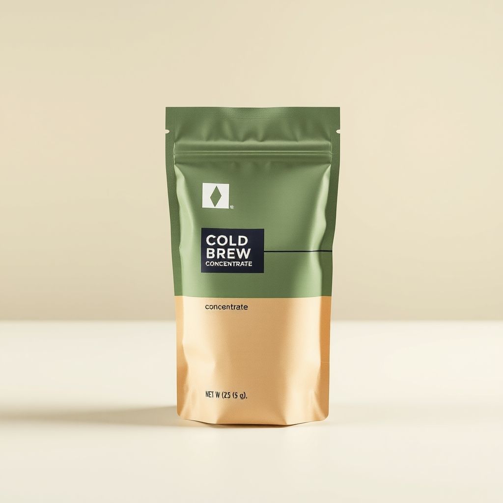
Visual description: A kraft-textured matte pouch split horizontally — sage green occupying the top two-thirds, warm cream-tan below. A single thin charcoal line divides the two color blocks at an asymmetric point (roughly 60/40 rather than center), with a small geometric diamond mark near the top as the only graphic element. The material reads as recycled kraft paper laminate rather than glossy plastic film.
Why it works: The asymmetric color split signals 'crafted, not mass-produced' — a well-documented shelf cue where centered, symmetric packaging reads as corporate/mass-market and off-center compositions read as artisanal. Sage and cream together test consistently in CPG color research as 'natural, premium, low-sugar' signals, which matters directly for a cold-brew concentrate audience that associates bright primary colors with artificially sweetened products.
Production note: Kraft laminate pouches run mid-tier cost — more expensive than glossy BOPP film, cheaper than glass or aluminum. Minimum order quantities for custom kraft stock typically start around 5,000 units.
Concept 2: Saturation Block
Visual description: A single saturated forest-green pouch, full-bleed color with no horizontal split, matte finish, and one bold horizontal cream stripe at eye level carrying the only typography.
Why it works: Full-bleed saturated color maximizes shelf standout distance — the metric packaging designers use for how far away a product remains visually distinct from competitors. This concept trades subtlety for visibility, appropriate if the brief prioritizes discovery over premium signaling.
Production note: Full-coverage color printing costs slightly more in ink but simplifies file prep versus multi-block designs.
Concept 3: Tactile Minimal
Visual description: An unbleached natural kraft pouch with no added color block, a debossed (pressed, not printed) geometric pattern, and a single small label patch.
Why it works: Debossing signals tactile premium quality disproportionate to its cost, and undyed kraft is the strongest 'zero added processing' visual cue in the sustainable-beverage category.
Production note: Debossing requires a custom die, adding tooling cost (roughly $800-1,500 one-time) but no added per-unit cost at volume.
Flagged tension: the brief's 'premium' positioning combined with a DTC startup's realistic budget constraints pulls toward Concept 1 or 3 over Concept 2 — saturated full-color printing often reads as 'trying hard' rather than premium at this price tier.
Note: the generated hero image for Concept 1 rendered some placeholder typography despite the prompt's no-text constraint — current image models render small text unreliably. Treat generated text in concept-stage mockups as a placeholder; the wordmark and final typography are a separate design pass.
تصویر تولیدشده
بیشتر Promptهای تولید تصویر با AI برای طراحی محصول، از یه الگوی تکراری پیروی میکنن: خروجی رو توصیف میکنی، یه عکس تحویل میگیری و امیدوار میمونی که به درد چرخه واقعی تولید بستهبندیت بخوره. اما این الگو طراحها و بازاریابها رو دقیقاً به یه دلیل مشخص ناامید میکنه؛ داشتن یه دونه تصویر هیچ امکانی برای مقایسه مسیرهای استراتژیک با همدیگه بهت نمیده، در حالی که تصمیم اصلی یه بنیانگذار یا مدیر مارکتینگ، قبل از اینکه بودجه رو بفرسته سمت ساخت نمونههای فیزیکی، دقیقاً انتخاب بین همین جهتگیریهاست.
این Prompt طوری طراحی شده که خروجی رو وادار به ایجاد تنوع و تمایز واقعی کنه. شرطِ "هر کدوم از ۳ کانسپت باید از یه استراتژی بصری واقعاً متفاوت استفاده کنن" به این دلیل اومده که بدون اون، بیشتر مدلها به طور پیشفرض میرن سراغ ۳ تا تغییر جزئی روی همون ایده؛ مثلاً ۳ تا طیف رنگی مختلف از یه مستطیل با بلوکهای رنگی یکسان. مشخص کردن دقیق محورهای تمایز (مینیمال، پررنگ/اشباع، و بافتدار/لمسپذیر) داخل این شرط، مرزهای خلاقانه ملموسی به مدل میده، نه یه سری دستور مبهم مثل "متفاوت باش" که مدلها هر دفعه یه برداشت متناقض ازش دارن. 🤖
قیدِ "بدون متن خوانا یا لوگو" یه سادهسازی کاملاً حسابشدهست، نه یه محدودیت. مدلهای تصویری فعلی تایپوگرافیهای ریز رو تمیز و قابلاعتماد رندر نمیکنن؛ اگه بخوای همزمان با کانسپت بستهبندی یه لوگوی نهایی هم تحویل بگیری، معمولاً یه متن نامفهوم و غیرقابلاستفاده بهت تحویل میدن. حذف کردن متن از بریف بصری و متمرکز نگهداشتن بحث طراحی روی فرم، رنگ و متریال، کانسپتهای به مراتب کاربردیتری به دست میده؛ اینطوری بعد از اینکه جهتگیری کلی انتخاب شد، توی یه مرحله جداگونه سراغ تایپوگرافی و لوگوتایپ میری.
الزام آوردن یادداشت تولید توی فرمت خروجی به این خاطره که تصمیمهای بستهبندی صرفاً زیباییشناختی نیستن. یه کانسپت جذاب که نیاز به قالب برش اختصاصی و حداقل سفارش ۵۰,۰۰۰ عددی داره، اصلاً گزینه واقعی برای اولین نوبت تولید یه استارتاپ ۱۲ نفره به حساب نمیاد. اضافه کردن اجباری یه خط توضیح درباره هزینه و پیچیدگی به هر کانسپت، باعث میشه خروجی دقیقاً روی چیزی متمرکز بمونه که یه تیم کوچیک واقعاً از پس اجراش برمیاد؛ نه اینکه کانسپتهای خیالی تولید بشه که دست هیچکس به ساختنشون نمیرسه. ⚡
دستورالعمل آخر، یعنی مشخص کردن تعارض بین مخاطب هدف و جایگاهسازی برند، جلوی خطایی رو میگیره که توی مراحل اولیه برندسازی مدام پیش میاد: بنیانگذار توی یه نفس هم تقاضای طرح "پریمیوم" داره و هم "نسل Z حساس به قیمت"، بدون اینکه حواسش باشه این دو تا به دو سمت بصری کاملاً متضاد کشیده میشن. وقتی مدل به جای اینکه بیسروصدا یکی از این دو برداشت رو انتخاب کنه، این تعارض رو شفاف و مشخص اعلام میکنه، یه گفتگوی استراتژیک شکل میگیره که تیم حتماً باید قبل از شروع هر کار طراحی دربارهش به توافق برسه.