El generador de mood boards: convierte una dirección estética vaga en cuatro conceptos visuales distintos
Por qué importa este prompt
Founders who skip a shared visual reference before briefing a designer typically burn two or three rounds of paid revisions on directions that were never going to work, because 'warm and premium' meant something different to everyone in the room from the start. A single generated mood board turns a vague pair of adjectives into four falsifiable options — the founder can point at one and say 'more like this,' which is an actual decision, not another vibe check disguised as feedback.
Para qué lo usamos
You're a solo founder launching a DTC coffee brand. Your only creative brief from your co-founder was 'modern but warm, sustainable but premium' — vague enough that you, your designer, and your co-founder could each be picturing something completely different. You need four concrete visual directions to react to before the first design meeting, not another round of 'send me some inspo links.'
Prompt
Role: Act as an expert visual and brand designer creating an initial mood board concept for a new project.

Context:
- What we're designing for: [DESCRIBE YOUR PROJECT/BRAND/PRODUCT]
- The aesthetic direction I've been given (in the vague, unhelpful form it usually arrives in): [PASTE THE VAGUE ADJECTIVES OR BRIEF YOU RECEIVED, e.g. "modern but warm, sustainable but premium"]
- Anything that's already fixed and shouldn't change: [OPTIONAL — e.g. existing logo, a color that must appear, a material constraint]

Task: Generate a single image containing a 2x2 grid mood board. Each of the four quadrants must represent a genuinely different visual interpretation of the aesthetic direction above — not four variations of the same idea, but four different ways a reasonable designer could read those same vague words.

Constraints:
- No readable text, words, or labels anywhere in the image
- Each quadrant must differ in at least two of: color palette, material/texture, lighting mood
- Ground every quadrant in realistic materials and photography-style lighting rather than abstract shapes — the point is to react to something concrete
- Keep all four quadrants at comparable visual quality and framing so they're fairly comparable side by side

Output Format: One combined image, 2x2 grid layout, no text or labels, photorealistic product/material photography style, consistent framing across all four quadrants, 16:9 or square aspect ratio.
Resultado
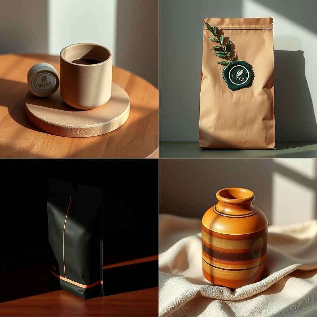
Generated mood board — four distinct directions for the coffee brand, from a single "modern but warm, sustainable but premium" brief:
Top-left — Minimalist Warm: Matte ceramic packaging in muted terracotta and cream tones, resting on warm oak wood, soft directional morning light. Reads as approachable premium — the "warm" half of the brief taken literally through color temperature and natural materials.
Top-right — Sustainable Editorial: Recycled kraft paper bag with a deep forest-green wax seal and a single botanical sprig, moody low-key lighting reminiscent of an editorial food magazine spread. Leans hardest into "sustainable," using visible recycled texture as the premium signal rather than gloss or foil.
Bottom-left — Modern Luxury: Sleek matte black packaging with one thin copper foil accent line, dramatic studio lighting with hard shadow falloff. This is "modern but warm" read as restrained, high-contrast minimalism — warmth carried entirely by the copper accent rather than the palette.
Bottom-right — Rustic Craft: Hand-thrown stoneware canister in an amber glaze, natural linen surface, golden-hour side lighting. The most tactile, least "modern" of the four — included deliberately as the direction most likely to get cut, so the founder can see and reject it with a reason instead of never considering it.
None of these four are the final direction. The point of the mood board is that the founder can now say "quadrant one, but with more of quadrant two's paper texture" — a specific, buildable note — instead of another round of sending the designer five unrelated Pinterest links and hoping the next draft lands closer.
Imagen generada
La mayoría de los briefs creativos mueren en el mismo lugar: alguien dice que la marca debe sentirse "moderna pero cálida" o "de lujo pero accesible", y todos en la sala asienten porque las palabras suenan razonables, no porque estén de acuerdo en lo que significan. El diseñador parte de una interpretación, el fundador tenía otra en mente, y el primer borrador se rechaza no porque sea mal trabajo, sino porque nunca iba a coincidir con una imagen que solo existía en la cabeza de una persona.
Este prompt está diseñado para cortocircuitar ese modo de fallo al forzar cuatro interpretaciones visuales genuinamente distintas en una sola imagen de moodboard, en lugar de un concepto pulido que puede o no funcionar. La restricción de que cada cuadrante use una paleta de colores, un material y un enfoque de iluminación diferentes es deliberada — cuatro variaciones de la misma idea no le dan a nadie una decisión real que tomar, solo confirman la primera apuesta del modelo cuatro veces con diferentes recortes.
La otra decisión deliberada es generar una imagen combinada en lugar de cuatro separadas. Una cuadrícula de 2x2 pone las cuatro direcciones en el mismo encuadre, al mismo tamaño y con iluminación comparable — lo que las hace genuinamente comparables para una persona que las ve lado a lado. Cuatro imágenes separadas generadas de forma independiente tienden a desviarse en escala, tono y calidad de maneras que vuelven la comparación menos honesta de lo que parece.