The Product Packaging Concept Generator: Turn a Brand Brief Into Shelf-Ready Visual Directions
Why this prompt matters
CPG brands that skip concept exploration and jump straight to final packaging art routinely burn $15,000-$40,000 in wasted tooling and print runs when the first design doesn't perform on shelf. Testing three genuinely different visual strategies before committing catches positioning mismatches — like a 'premium' brand that accidentally reads as budget private-label — before a single carton goes to print.
What we use it for
You're the marketing manager at a 12-person DTC beverage startup. Your co-founder wants packaging that "pops on a Whole Foods shelf," you have no in-house designer, and the agency quote for three initial concepts is $8,000 with a three-week turnaround. You need three visually distinct directions to bring into tomorrow morning's founder meeting.
Prompt
Act as a senior packaging designer with expertise in CPG (consumer packaged goods) shelf strategy.

Context: I'm developing packaging for [PRODUCT NAME], a [PRODUCT CATEGORY] targeting [TARGET AUDIENCE]. The brand positioning is [BRAND POSITIONING, e.g., premium/eco-friendly/playful/minimalist]. The packaging format is [FORMAT: box, bottle, pouch, can, jar]. Primary brand colors are [COLOR PALETTE]. Competitors on the shelf include [COMPETITOR BRANDS].

Task: Generate three distinct packaging concept directions. For each concept, provide:
1. A concept name
2. A one-paragraph visual description (shape, color blocking, material finish, texture)
3. The psychological/shelf-impact rationale — why this concept stands out or signals the right positioning
4. One production consideration (cost tier, material sourcing, or manufacturing complexity)

Constraints:
- Do not include specific logo wordmarks or legible text in the visual descriptions — focus purely on shape, color, material, and composition
- Each of the three concepts must use a genuinely different visual strategy (e.g., one minimalist, one bold/saturated, one textured/tactile) — do not give three variations of the same idea
- Ground every claim in a real packaging design principle (shelf standout distance, color psychology, material-signals-price-point), not generic adjectives
- Flag if the target audience and brand positioning are in tension (e.g., 'premium' + 'budget-conscious Gen Z' need reconciling)

Output format:
For each of the 3 concepts, use this structure:
**Concept [number]: [Name]**
- Visual description: [paragraph]
- Why it works: [paragraph]
- Production note: [1-2 sentences]
Result
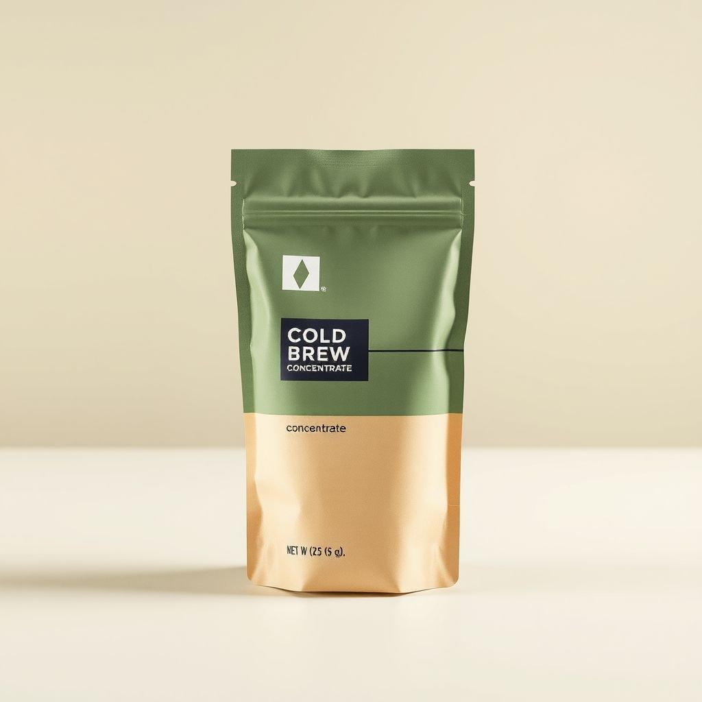
Concept 1: Field Study
Visual description: A kraft-textured matte pouch split horizontally — sage green occupying the top two-thirds, warm cream-tan below. A single thin charcoal line divides the two color blocks at an asymmetric point (roughly 60/40 rather than center), with a small geometric diamond mark near the top as the only graphic element. The material reads as recycled kraft paper laminate rather than glossy plastic film.
Why it works: The asymmetric color split signals 'crafted, not mass-produced' — a well-documented shelf cue where centered, symmetric packaging reads as corporate/mass-market and off-center compositions read as artisanal. Sage and cream together test consistently in CPG color research as 'natural, premium, low-sugar' signals, which matters directly for a cold-brew concentrate audience that associates bright primary colors with artificially sweetened products.
Production note: Kraft laminate pouches run mid-tier cost — more expensive than glossy BOPP film, cheaper than glass or aluminum. Minimum order quantities for custom kraft stock typically start around 5,000 units.
Concept 2: Saturation Block
Visual description: A single saturated forest-green pouch, full-bleed color with no horizontal split, matte finish, and one bold horizontal cream stripe at eye level carrying the only typography.
Why it works: Full-bleed saturated color maximizes shelf standout distance — the metric packaging designers use for how far away a product remains visually distinct from competitors. This concept trades subtlety for visibility, appropriate if the brief prioritizes discovery over premium signaling.
Production note: Full-coverage color printing costs slightly more in ink but simplifies file prep versus multi-block designs.
Concept 3: Tactile Minimal
Visual description: An unbleached natural kraft pouch with no added color block, a debossed (pressed, not printed) geometric pattern, and a single small label patch.
Why it works: Debossing signals tactile premium quality disproportionate to its cost, and undyed kraft is the strongest 'zero added processing' visual cue in the sustainable-beverage category.
Production note: Debossing requires a custom die, adding tooling cost (roughly $800-1,500 one-time) but no added per-unit cost at volume.
Flagged tension: the brief's 'premium' positioning combined with a DTC startup's realistic budget constraints pulls toward Concept 1 or 3 over Concept 2 — saturated full-color printing often reads as 'trying hard' rather than premium at this price tier.
Note: the generated hero image for Concept 1 rendered some placeholder typography despite the prompt's no-text constraint — current image models render small text unreliably. Treat generated text in concept-stage mockups as a placeholder; the wordmark and final typography are a separate design pass.
Generated Image
Most AI image-generation prompts for product work follow a single pattern: describe the output, get a picture, hope it works for your actual packaging workflow. That pattern fails designers and marketers for one specific reason — a single image gives you no way to compare strategic directions against each other, which is the actual decision a founder or marketing lead needs to make before committing budget to physical samples.
This prompt is built to force genuine divergence. The constraint "each of the three concepts must use a genuinely different visual strategy" exists because without it, most models default to three minor variations of the same idea — three shades of the same color-blocked rectangle. Naming the specific axes of difference (minimalist, bold/saturated, textured/tactile) in the constraint gives the model concrete creative boundaries instead of vague instructions to "be different," which models interpret inconsistently.
The "no legible text or logos" constraint is a deliberate simplification, not a limitation. Current image models render small typography unreliably — attempting a finished logo mark in the same pass as the packaging concept usually produces garbled, unusable text. Stripping text out of the visual brief and keeping the design conversation focused on shape, color, and material produces far more usable concept art, with wordmark and typography handled as a separate, later design pass once a direction is chosen.
The production-note requirement in the output format exists because packaging decisions are not purely aesthetic. A beautiful concept that requires a custom die tool and a 50,000-unit minimum order is not a real option for a 12-person startup's first production run. Forcing a one-line cost/complexity signal into every concept keeps the output grounded in what a small team can actually execute, rather than generating aspirational concepts no one can afford to produce.
The final instruction — flag tension between target audience and brand positioning — catches a failure mode that happens constantly in early-stage branding: a founder asks for "premium" and "budget-conscious Gen Z" in the same breath without noticing those pull in opposite visual directions. Having the model name that tension explicitly, rather than silently picking one interpretation, surfaces a strategic conversation the team needs to have before any design work starts.